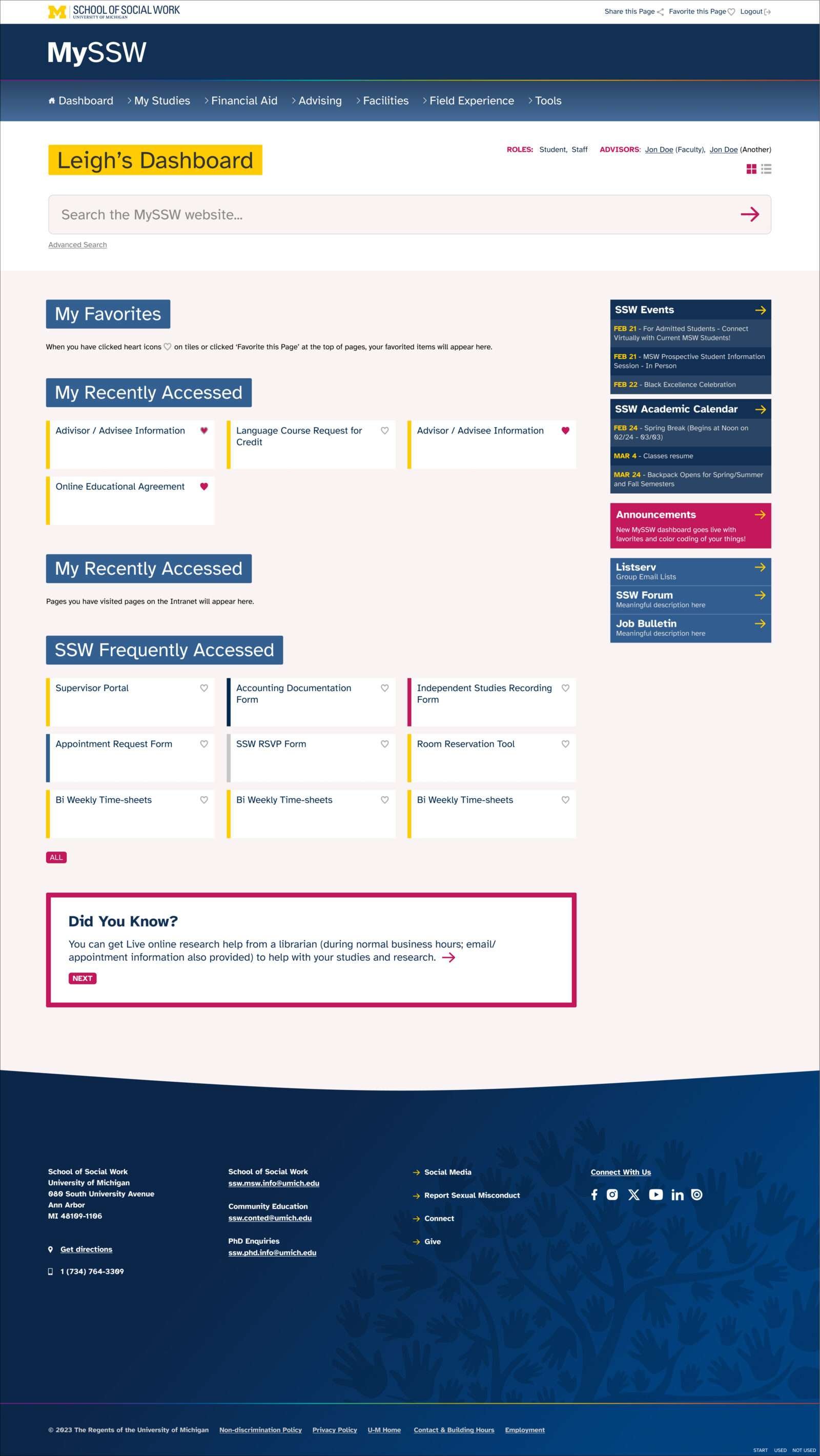
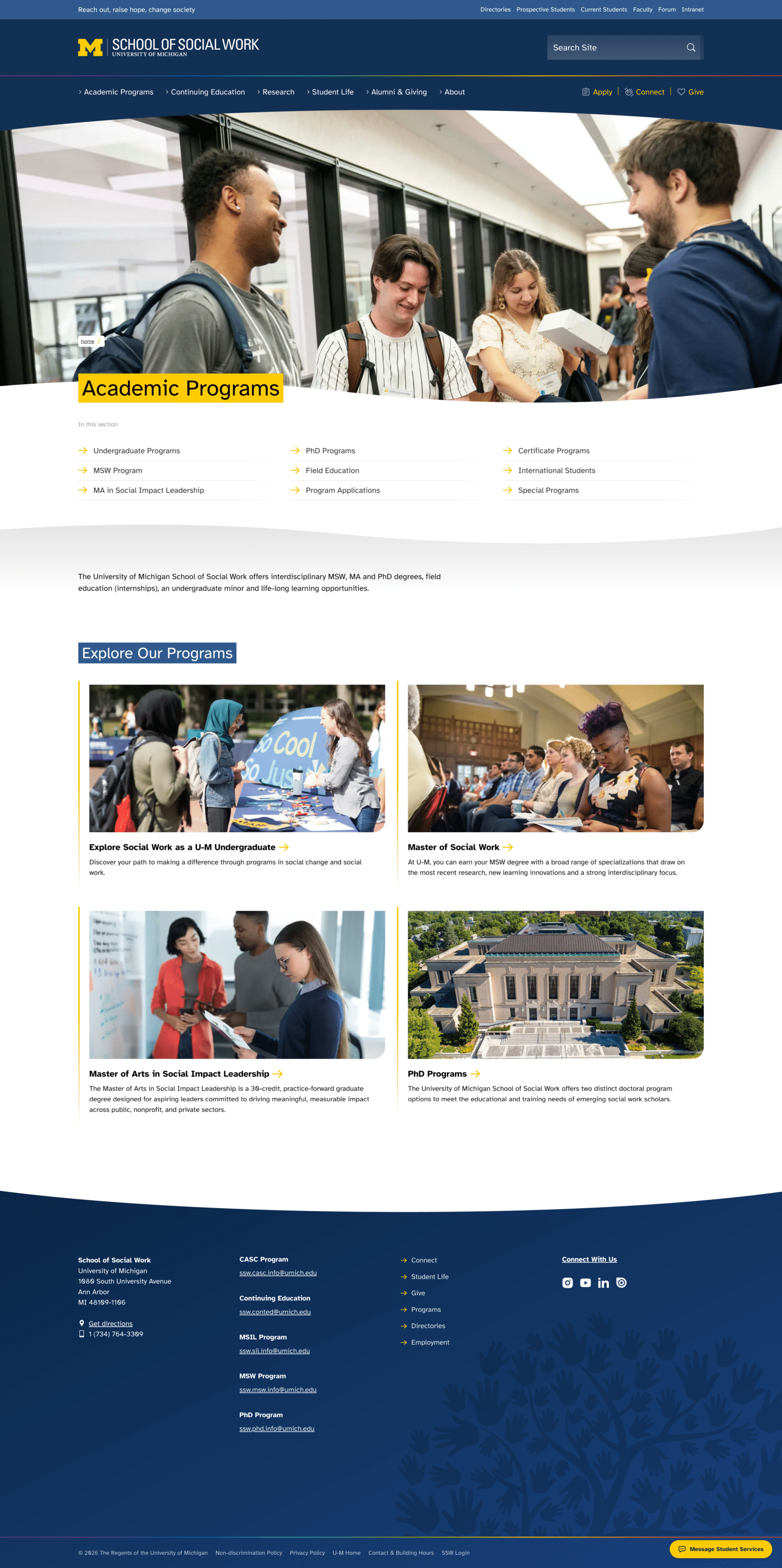
The University of Michigan’s brand is world famous. Many people know the maize and blue, the block ‘M’, and even the “go blue” slogan. It is a brand that portrays strength, prestige, and tradition.
Research showed that qualities such as prestige were important for SSW but only if balanced with attributes more commonly associated with social work, such as care, inclusivity, and being welcoming.
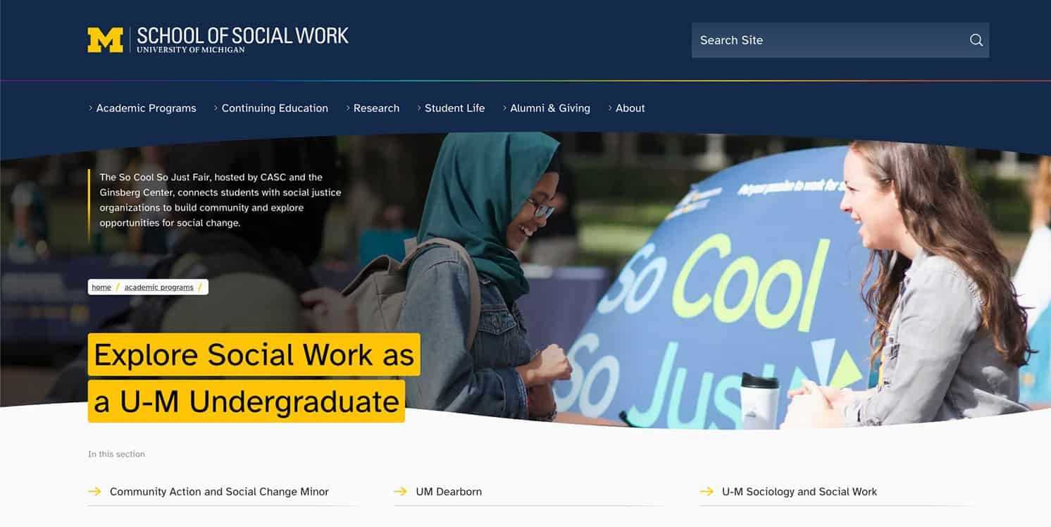
Not being able to stray too far from the main overarching university brand but I did introduce the following unique elements to help portray SSW’s softer characteristics:
- A curve to frame banner images and separate sections
- A ‘rainbow’ style used as a separator and in the curve (this was a gradient of the entire University of Michigna colour palette)
- The addition of a highlight pink to the Social Work colour palette
- The use of a super-readable font: Atkinson Hyperlegible
- A beating heart that displays on rollover of SSW’s tag line: Reach out, raise hope, change society
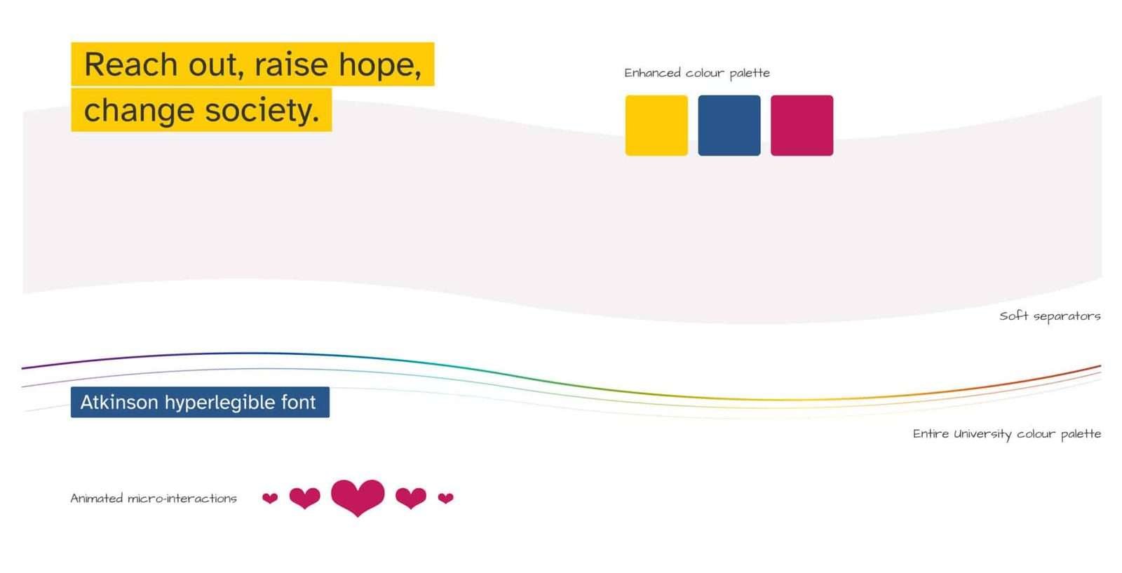
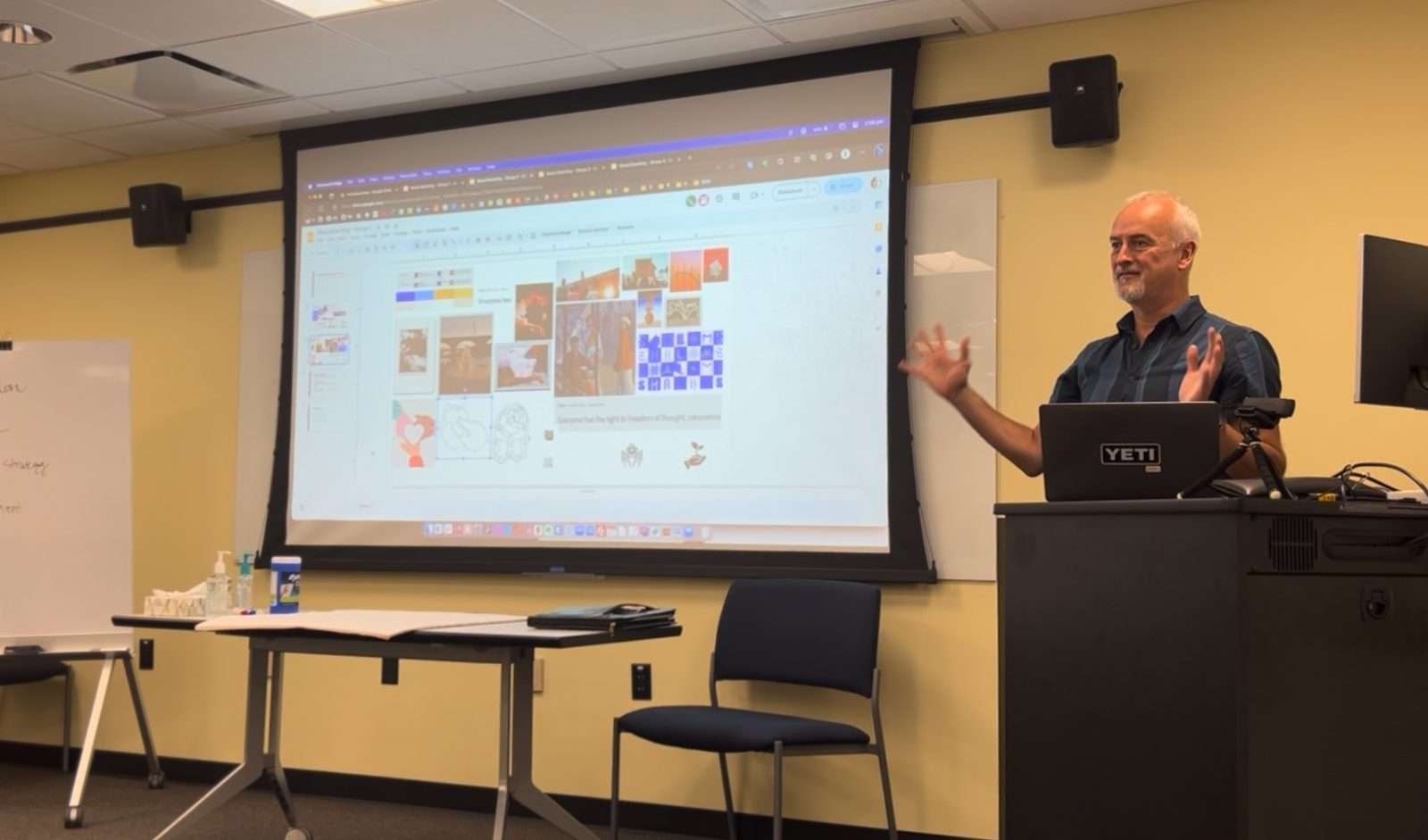
As a second project I redesigned the entire intranet experience for the department. I conducted a 3 day workshop with staff and student on sit in An Arbor, to get to grips with the current system and frustrations.
I mocked up a whole new experience and did some preliminary testing getting instant feedback from students. This included a personalised dashboard allowing people to add favourite resources, whilst ensuring new content was exposed to them.